References
Moodboard, wardrobe & styling, and look & grade direction live together — they overlap and constrain each other. Add images by dropping files into public/karis-production/references/ and referencing them from lib/references.ts.

Source of truth
Karis Parenting — Brand Guide
Logos, color, type, photography direction, brand voice. The source of truth for everything in this section.
Moodboard & References
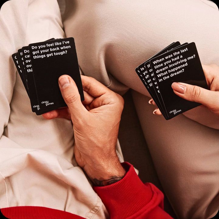
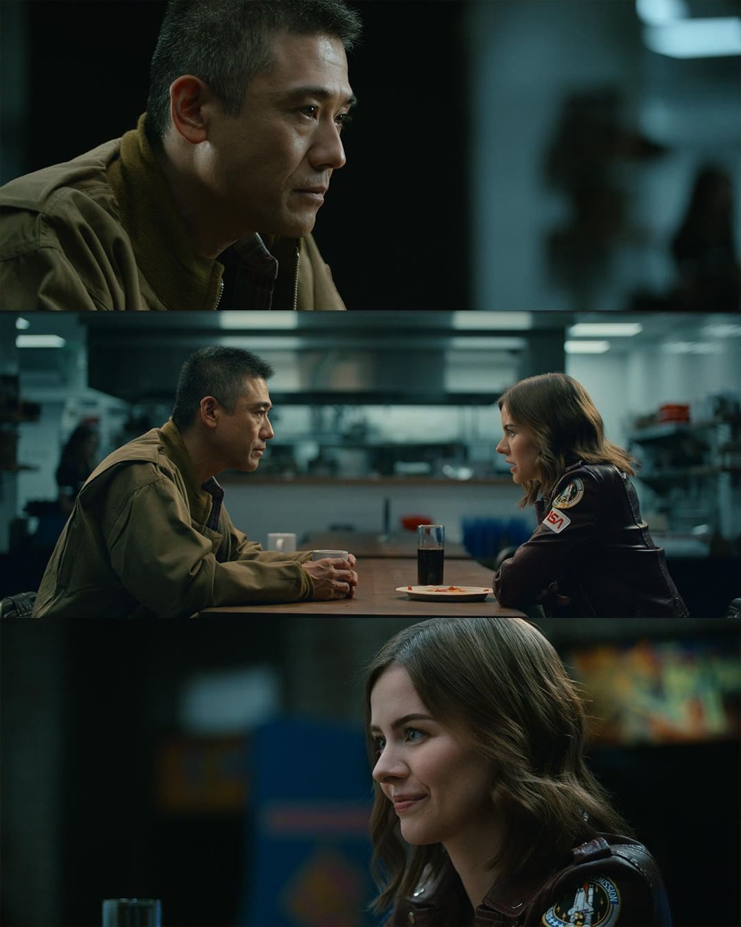
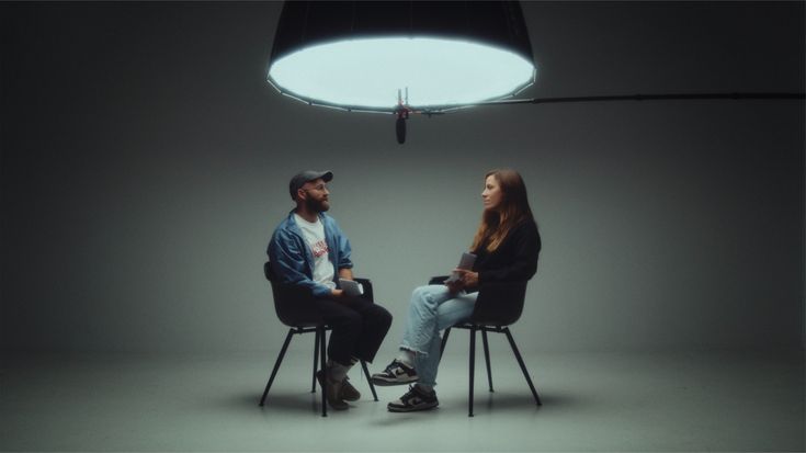
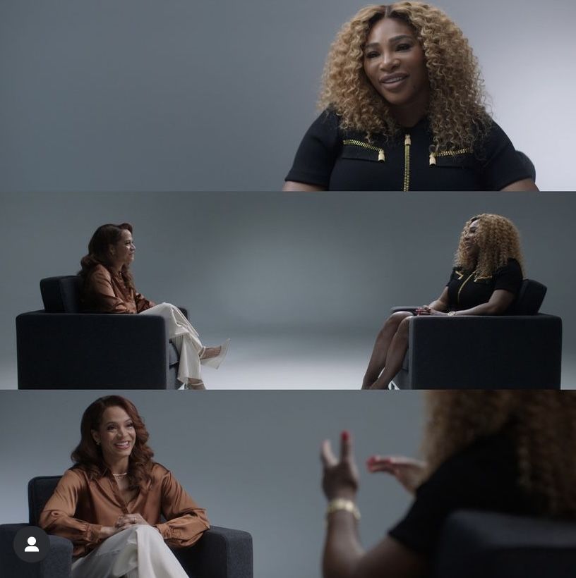
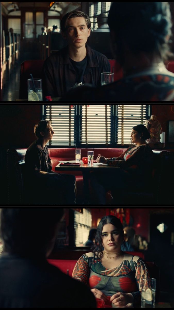
The overall feel: warm, honest, team-oriented. Imagery should feel like a real evening at home — not an ad. Lean into texture (linen, wood, paper), shallow depth of field for connection beats, and clean studio neutrality for product shots. Brand palette anchors the look: karis purple, eggshell, canary, robin’s-egg accents.
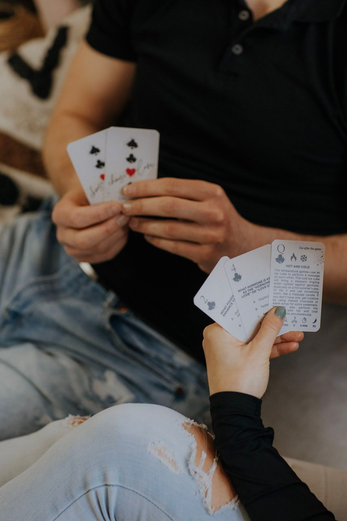
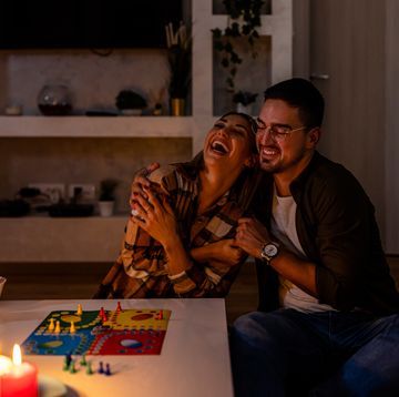
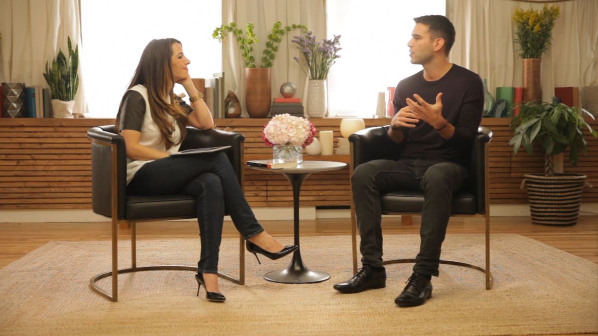
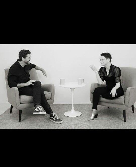
Couples shot examples
Reference frames for the couples on screen — warmth, intimacy, real moments. Use these to calibrate physical closeness, eye contact, and where the camera sits.




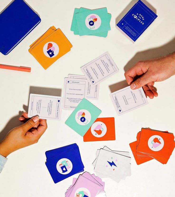
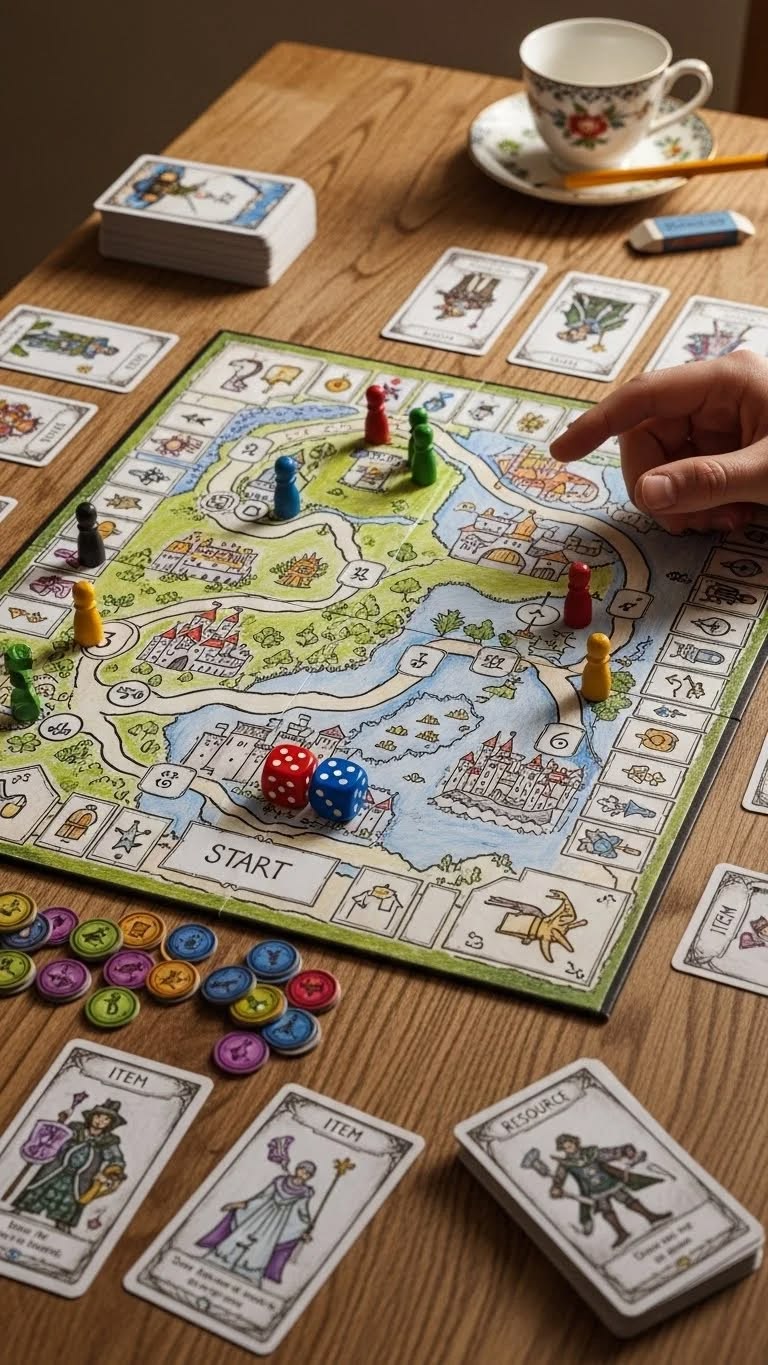
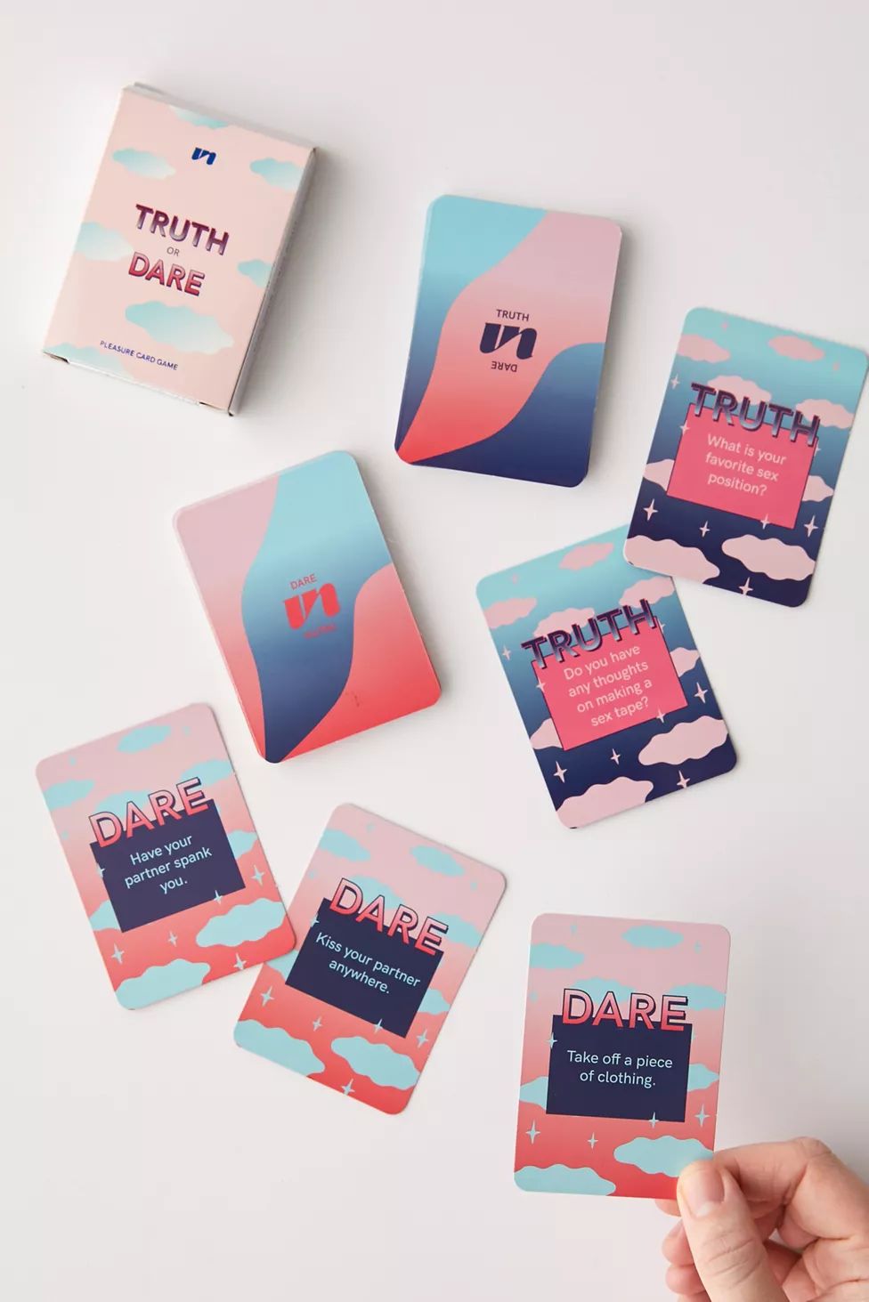
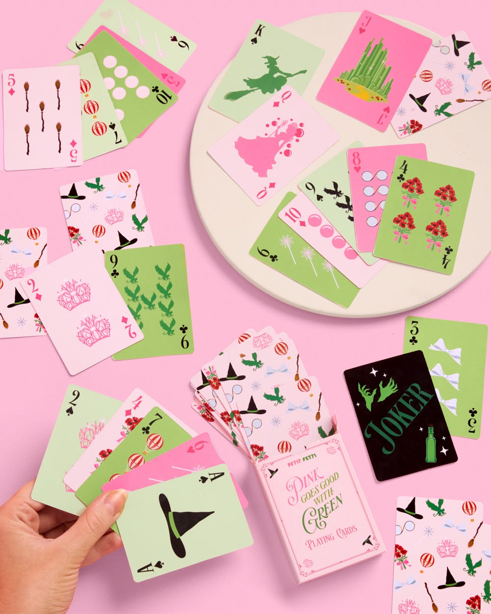
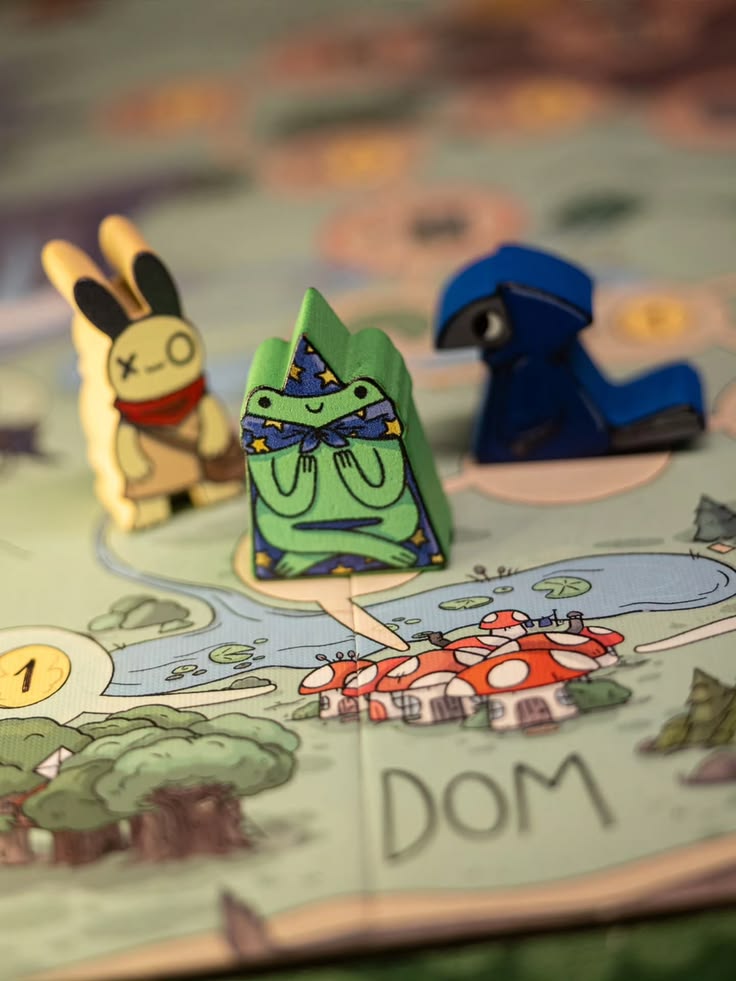
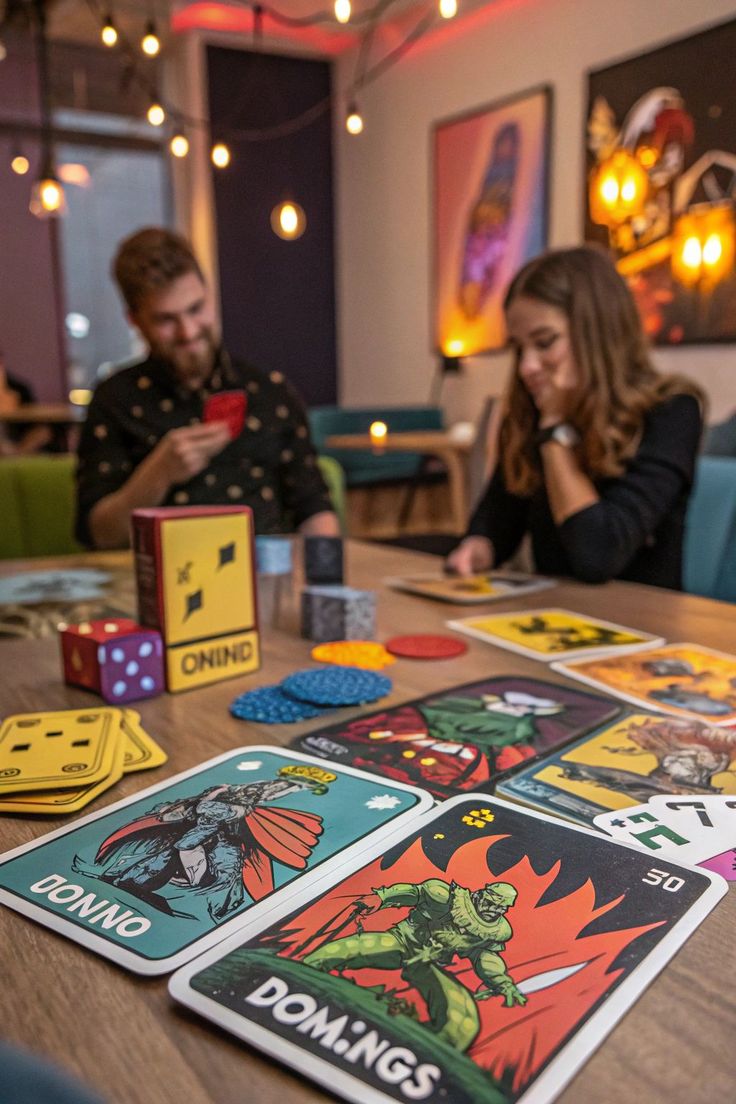
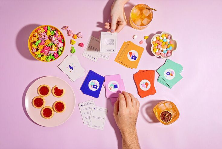
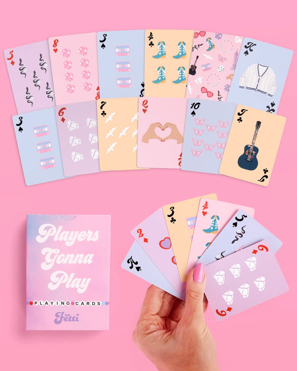
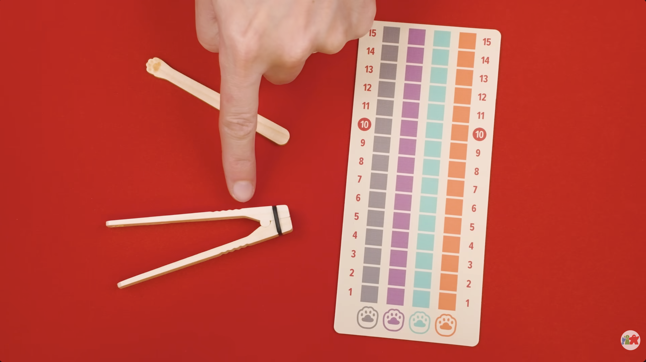
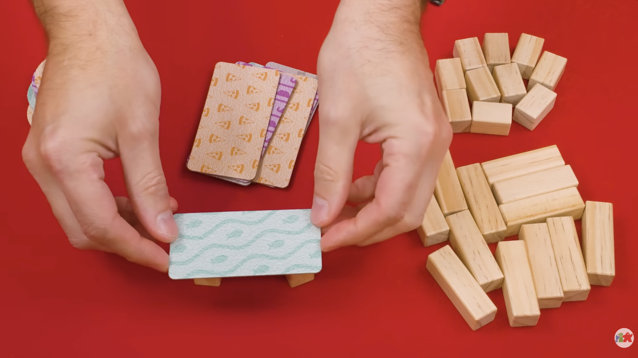
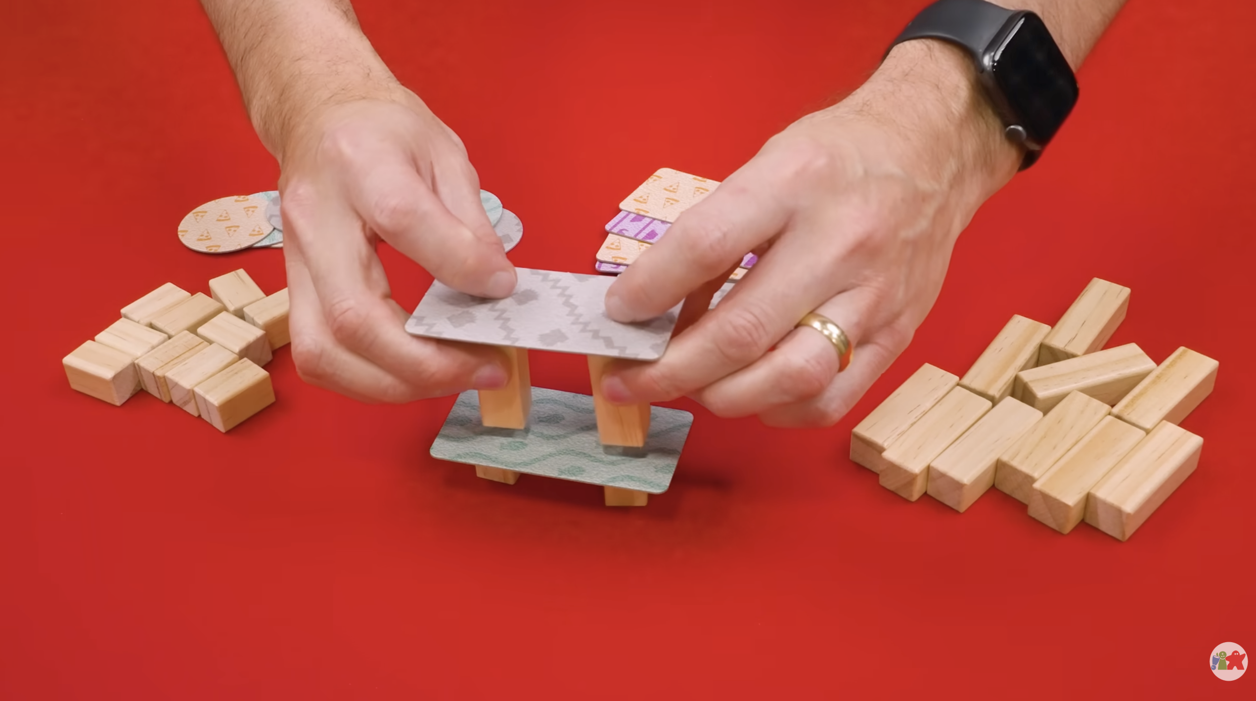
Gameplay shot examples
Reference frames for gameplay beats — hands at the table, cards, tokens, board. Use these to calibrate framing, lighting, and the rhythm of in-game moments.